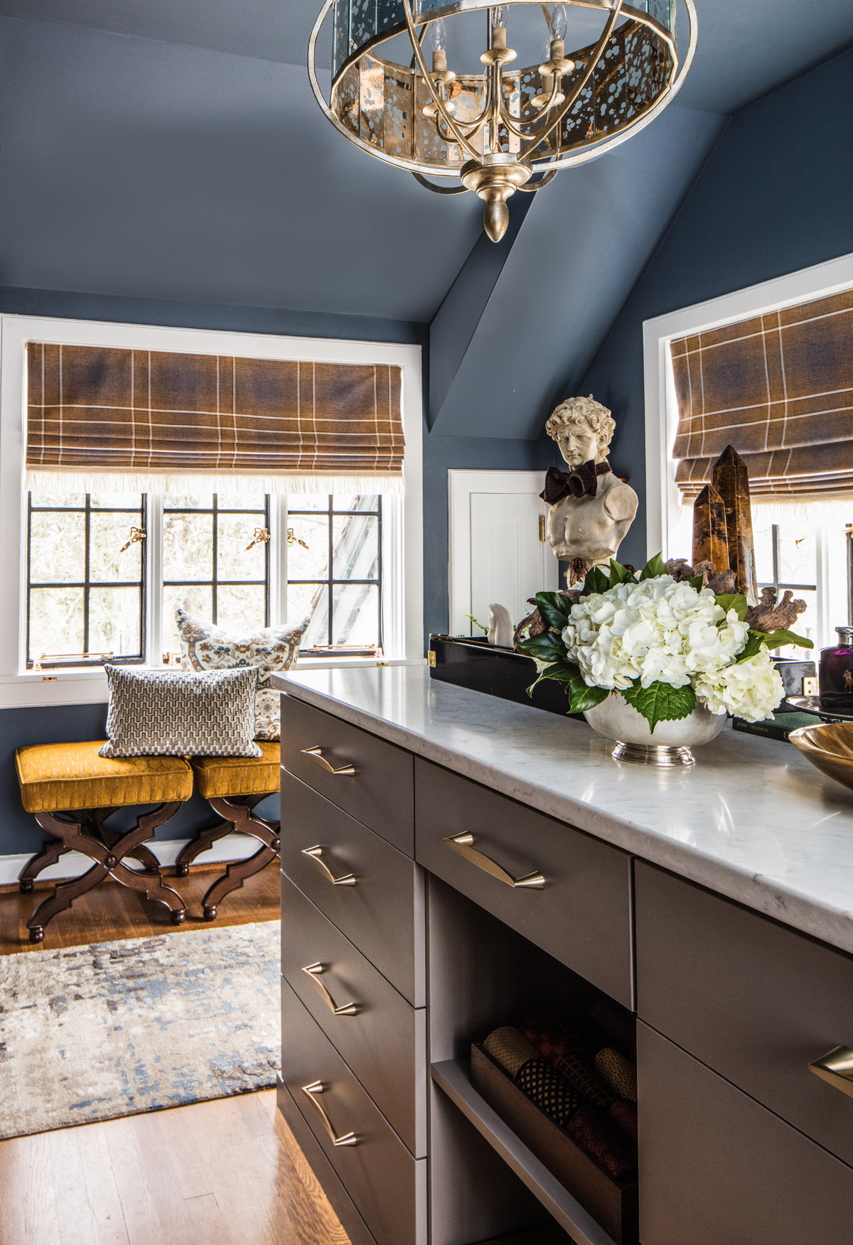
Designs in shades of Sherwin-Williams blue
The primary colors in Sherwin-Williams palette of the week are calm shades of blue with a pop of gold. We’ve gathered designs to show you how professionals put the colors to use in the home or office.

The primary colors in Sherwin-Williams palette of the week are calm shades of blue with a pop of gold. We’ve gathered designs to show you how professionals put the colors to use in the home or office.
Learn how you can use Vishion to find matching wallpaper and paint in your home design.
Using color digitally can be challenging, but that didn’t stop us. Here’s how Vishion is tackling the complexities of color.
Those that work with color know it can be temperamental when it comes to everyday technology. Some cameras have a hard time capturing the brilliance of a color. Images of items online might be altered too much during editing, changing the colors actual appearance. The brightness setting on a phone or computer screen can potentially change the hues presented.
Vishion is working with color experts, brands and partners to improve how color can be used online to achieve your home design goals. As we launch our mobile app, we want to show how you can use color now and what to expect in the future.
To ensure Vishion users begin with the correct color, we are working with Sherwin-Williams and Pantone, as well as enabling the use of HEX, RGB and HSB values. Colors can be pulled from images as well, but users must be confident the image reflects the correct color.
The image seen above is in Vishion’s office. When you pull the color from an image, confirm the accuracy of the color pulled against the item you want to match. Confident Yellow is the actual color of the wall pictured, showing the accuracy of the Vishion search when the right color is shown.
I took a picture of the same area of the office with bad lighting. Needless to say, this produced the wrong results. Color is extremely temperamental to light. Make sure the image reflects the color you’re considering as much as possible.
The other side of the search is the products featured. We are working with brands beginning this fall to ensure the accuracy of our search results. End-to-end color accuracy will take time and we are the first to tackle the initial steps of exploring color online.
We are excited to help you find new things to create a unique space. As you search for items to complete your design, remember the brighter and more saturated the color is the more limited the results.
Vishion will provide results that are as close to your selected color as possible, but remember you can find complementary colors if you want to further explore options that match your preferred shade.
The leadership team at Vishion is continually partnering with popular and unique brands to ensure our search engine has looked in every store on the planet.
Photo by Christelle Bourgeois
With every search, Vishion improves. Over time you’ll see more results and color accuracy will be improved. We focus on the complexities of color to improve the online experience.
We are constantly looking for ways to make it easier to explore how color can be used for home design. If you have suggestions as to how we can make our app better for you, let us know! If you haven’t already, download the Vishion app today.
Samantha Smith started Vishion in 2017 after struggling to find a specific piece of home decor in the perfect color. Thus, was born Sam’s vision for Vishion. Today, the color search engine partners with some of the top brands in the world to help interior design professionals and design lovers search for products and designs by color, instantly.
When Smith isn’t pitching and traveling to various competitions or running her Vishion team, she can be found hanging with her husband, Steve, and their two dogs in Charlotte, NC.
Consider these 26 rugs when you’re looking add an easy pop of color below your feet.
There’s more than one way to make your Fourth of July party colorful. That’s why we’ve put together different variations of red, white and blue for you to consider for your party and home.
Gray has gotten a bad rap for being the “play it safe” color in home design. We’ll show you how bold home design can be when the normally dull shade is used in an adventurous way.