

Gray has gotten a bad rap for being the “play it safe” color in home design. We’ll show you how bold home design can be when the normally dull shade is used in an adventurous way.
Gray is one of the most popular colors in paint and decor because it fits so easily into your home design. Loving the shade doesn’t mean your design has to be dull. We pulled together designs by professionals who showcase how gray can pack a punch.
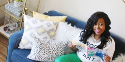
Home Designs in Gray
Gray palettes in art
Art can play a large role in making a plain room pop. When paired with a light gray wall, a unique piece of art that leans into your color palette can change the dynamic of the room.
We used our favorite gray palettes to showcase how you can use the Vishion app to search by color to find art. I may be biased about my favorite gray palette because the first colors from Sherwin-Williams showcase the exact paints that fill my home.
Sherwin-Williams Paint
Pantone Palette
If you’re looking for art to spice up your office, you may lean on Pantone to collect colors to represent your brand. The Vishion app allows users to search by Pantone colors to send you in a direction that goes with your preferred palette.
Find Gray Palettes from your Surroundings
Whenever you see gray in a stunning landscape, take a picture. With Vishion you have the ability to pull and play with the colors intertwined with the shade to see how you can use it in your design. Look to your surroundings to go bold with gray in your home design.
Consider this image of a mountain from Cristina Gottardi. I took the Vishion app and found paint colors that match the stunning landscape. Below you’ll see an example of Sherwin-Williams paint Cascades which can be seen in the water.
Follow Vishion on Instagram or Facebook and, if you haven’t already tried it, get the app today.

Samantha Smith started Vishion in 2017 after struggling to find a specific piece of home decor in the perfect color. Thus, was born Sam’s vision for Vishion. Today, the color search engine partners with some of the top brands in the world to help interior design professionals and design lovers search for products and designs by color, instantly.
When Smith isn’t pitching and traveling to various competitions or running her Vishion team, she can be found hanging with her husband, Steve, and their two dogs in Charlotte, NC.

Search by color with Vishion
Find decor and beautiful spaces by color with Vishion.
Related Posts

Ready to search by color?
Download the Vishion app today.