Travel Palette: Sun-Soaked Pastels in Lisbon
Lisbon is the capital city of Portugal, boasting charisma and color in spades. Today on the blog, we explore the color and design trends in the sunny city of Lisbon.


Lisbon is the capital city of Portugal, boasting charisma and color in spades. Today on the blog, we explore the color and design trends in the sunny city of Lisbon.
With the cost of living in major cities on the rise, land is at a premium and space has become the ultimate luxury. In this article, we explore why spaces are getting smaller and how to use color to make a small space work hard.
From the expansive Arabian Desert to shiny skyscrapers and luxury shopping malls, Dubai seems to have it all. You can draw inspiration from Dubai’s color and design trends in this ultramodern city.
Working with interior designer Christy Wulfson, we used the space’s existing color palette to find art, fabric, and furniture with the Vishion app. Today we are sharing the Carriage House project on Vishion with other design lovers.
From Buckingham Palace to the staterooms of the White House, the critically acclaimed series, The Crown, incorporates multiple production designs that take our breath away.
Let us take a look inside one of the main sets for this season,Windsor Castle, with The Crown.
The most recent season of The Crown has taken the world by storm ever since its premiere. In the third season, we see the royal family from 1964 through 1977 as they face many trials and tribulations throughout a thirteen year span. While the cast is almost entirely different from the previous two seasons, Martin Childs remains the original production designer. Childs wanted to make sure that the audience felt familiarity from the past two seasons through his designs while also spicing things up with even more lavish environments and living spaces.
The interior of the Buckingham Palace set was built using several historic, abandoned houses to double as a variety of palace rooms. The new season was shot on 400 sets, showing just how much detail and work was put into the replication of each room. Childs made sure to tell a story within each architectural decision created, making it easier for the audience to follow the royal family throughout the story.
Color plays a very important role in the storytelling of The Crown and adds a key dimension to the show as a whole. Dark colors were used in the many costumes the queen wore to match the extravagance of the locations she was in. Many shadowy hues of reds, greens, golds, and blues are seen throughout each room and accessories used too.
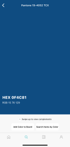
Shown below, the Autumn and Winter palette from Pantone showcases the perfect combination of colors that are seen within each room of The Crown. The mix of cranberry, merlot, forest biome, hazel, and bluestone make up this palette and truly are royal worthy.
Want to recreate these Crown-inspired looks? Download the Vishion app and transform your space into a palace fit for the royal family. Find and save color palettes to your Vishion boards, and search for matching products.
Kravet Celebrates Pantone Color of the year 2020 via Kravet Blog
Zakiya is a freelance lifestyle journalist, reporting on interior design, creativity, and sustainability.