fbpx

Color 101 | Your Guide To Colorful Design

If you find color theory to be daunting and difficult to understand, you can take solace in the fact that there are several tried-and-true, logic-based color rules that cater to professional designers and design lovers. Keep reading to find out how these rules can make you look at color in a whole new light.

Design by Summer Thornton

The 60-30-10 Rule

If you’re puzzling over how many colors and how much of each is appropriate to have in one room, consider the 60-30-10 ratio. This ratio tells you two things: 

  • You should aim for three colors per room, including your dominant color (perhaps a neutral of some sort), a secondary color (which can be a bit bolder than your dominant color), and an accent color.
    • The dominant color should account for approximately 60 percent of the room
    • The secondary color should account for approximately 30 percent
    • The accent color should account for approximately 10 percent

The Color Wheel 

color wheel for complimentary and analogic colors

Image by DavidZydd from Pixabay

The color wheel can be used to conceive a variety of aesthetically balanced color combinations, the most basic of which is a complementary color scheme.

Complimentary Colors

As far as the color wheel is concerned, complimentary refers to the two shades directly opposite each other on the wheel.

Analogic Colors

analogic color combination graph

Photo by Presentitude

Another fairly simple color scheme to consider is analogous, which involves picking a central color and then using the colors on either side. With an analogous color scheme, two colors will be primary colors and the third will be a mix of the two. 

Warm vs. Cool Colors

Warm color design by janskacelikart

Another way the color wheel can be used is to identify warm and cools colors, which affect the energy of your space.

Warm Colors

Warm colors, such as red, orange, yellow, brown, and tan are better suited to spaces used for entertaining, such as the dining room, living room, or kitchen.

Cool Colors

On the other hand, cooler colors, such as blue, green, purple, and gray tend to work better in spaces where calmness is important, such as the bedroom or home office.

Color Families

Making effective use of color families is a great way to employ ample color without overwhelming your space. For instance, if you’re working with a blue-orange complementary color scheme, your space can incorporate blue tones, such as turquoise, cobalt, and navy, in conjunction with tones in the orange family, such as coral and tangerine—without coming off too busy and arbitrary.

Color-and-Pattern Compromise

Image by midascode from Pixabay

If you’re partial to patterns, a good rule of thumb is to dial down your use of color, which will achieve a calmer, less chaotic effect. Less color will also give your pattern(s) of choice a chance to shine.

Color Hack: Blue & White

If you’re looking for a color combo that will never fail, look no further than blue and white. Reminiscent of a white shirt with blue jeans, the combo of blue and white is equal parts stylish and timeless. In the home, this classic duo comes off polished yet casual, making it well-suited to any room.

Inspire Your Design With Vishion

This slideshow requires JavaScript.

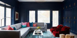
Want to use this design by Charlotte Coote as inspiration for your next project? Use the Vishion app to explore designs and decor by COLOR

  • Visit our website http://www.vishion.co and click “color search” or click here 
  • Upload an inspirational photo or type in a HEX color
  • Search for decor by your chosen color
  • Explore all decor options with Vishion
  • Find your perfect match and start your project today

Leave a Reply

Your email address will not be published. Required fields are marked *

Privacy Preference Center